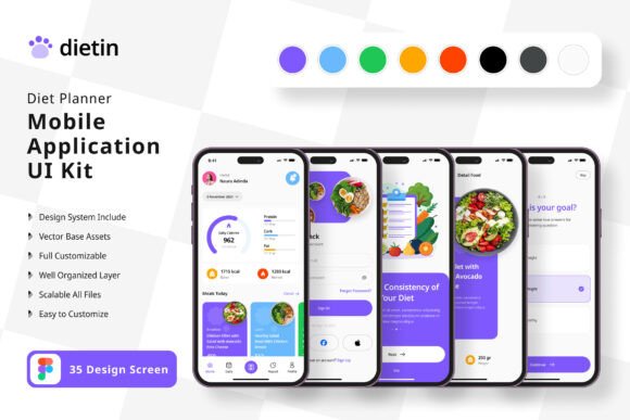
Diet Planner App Mobile UI KIT: A Practical Framework for Building Your Own Nutrition Application
Building a mobile application from scratch demands time, technical skill, and a clear vision of the user experience. For anyone working on a diet or nutrition-focused app, the interface design alone can become a bottleneck between concept and launch. The Diet Planner App Mobile UI KIT addresses this challenge directly by providing a structured set of 35 pixel-perfect screen designs that serve as a foundation rather than a finished product. This kit is not a one-size-fits-all template but a flexible framework that fits into a larger design and development workflow.
What the Diet Planner App Mobile UI KIT Offers in Practice
At its core, this kit contains 35 screen designs, 80 UI elements, and 100 vector layers, all fully editable in Figma. The emphasis is on practical customization. You can add or remove elements as your project requires, without being locked into a rigid layout. The 100 scalable vectors and free icon set mean that visual consistency is built in from the start. Color styles are easy to adjust, which is useful when aligning the interface with an existing brand palette or designing for different dietary niches such as meal tracking, calorie counting, or recipe management.
All images used in previews are placeholder visuals only. What you download are the layered, editable components. This matters because it forces you to supply your own content, ensuring that the final interface reflects your actual product rather than generic stock imagery.
Where This Kit Fits in a Broader Product Workflow
Designing a mobile app typically moves through several phases: research, wireframing, visual design, prototyping, development, and testing. The Diet Planner App Mobile UI KIT sits most naturally in the visual design and prototyping phases, but its structure also informs earlier planning stages. If you are an entrepreneur sketching out a meal planning service, browsing through the 35 screens can clarify which features are essential and which can be deferred. For a freelancer or small agency, having a complete set of UI elements reduces the time spent on repetitive design tasks, freeing you to focus on flows that are unique to your client's needs.
For educators or bloggers creating content about app development, this kit can serve as a teaching tool. You can dissect individual screens to explain navigation patterns, information hierarchy, or component states. Marketers working on product demos can use the kit to create realistic mockups without hiring a designer for every iteration.
Practical Integration into Your Existing Toolset
The kit is built for Figma, which means it integrates directly with one of the most widely used collaborative design platforms. If your workflow already includes Figma for prototyping or handoff to developers, adding this kit is straightforward. You can import the file, explore the layers, and start modifying immediately. The symbol objects and fully layered structure allow you to maintain consistency across screens even as you make adjustments.
Preparation is minimal. Before opening the file, it helps to have a clear list of the screens your application actually needs. Not every one of the 35 screens may be relevant to your specific project. By identifying which screens to keep, which to modify, and which you can skip, you avoid unnecessary rework. This is a simple but effective planning step that many people overlook when using UI kits.
Adapting the Kit for Different Types of Diet Applications
A diet planner app can take many forms. It might be a calorie counter, a macro tracker, a recipe aggregator, a meal prep scheduler, or a guided nutrition program. The kit's screens are general enough to support any of these directions, but the customization you apply will determine the final user experience. For example, if your app focuses on habit formation, you might prioritize screens that show streaks or progress over time. If your app is recipe-driven, you will emphasize search, filtering, and ingredient list views.
The ability to adjust color styles quickly is valuable when targeting different audiences. A professional audience may prefer muted, neutral tones, while a consumer wellness app might benefit from vibrant, energetic colors. Because the kit uses vector layers and symbol objects, changing the color palette across all screens can be done in minutes rather than hours.
Implementation Tips for a Smooth Workflow
When you start working with this kit, consider your screen flow first. Open the file and map out how each screen connects to the next. This is a crucial step that directly affects user navigation. Use the existing screens as a baseline, but do not hesitate to duplicate and modify them to create intermediate states or variations that your app requires.
Since the kit includes 80 UI elements, you have a library of buttons, input fields, cards, and navigation components at your disposal. Instead of designing each element from scratch, focus on arranging these components into logical groups. This approach speeds up the design process considerably and ensures that visual consistency holds across the entire application.
One practical observation: the free font included with the kit can be a starting point, but you may want to replace it with a typeface that matches your brand identity early in the process. Doing this before you invest time in fine-tuning layouts prevents the need for re-adjusting spacing and alignment later. Similarly, the free icon vector set is useful for prototyping, but production applications may require custom icons for unique features. Plan for that transition early.
Quality Control and Consistency Across Screens
Consistency is one of the biggest challenges in mobile UI design. When multiple screens are built independently, small discrepancies in spacing, font sizes, or button styles accumulate and degrade the user experience. Because this kit provides a unified set of components and styles, it helps you maintain quality control from the start. The fully layered file structure allows you to inspect any element and replicate its properties across other screens.
As you customize, keep a copy of the original file for reference. This is a simple safeguard. If you experiment with a radical layout change and later decide it does not work, you can revert to the baseline without losing your other screens. This is especially useful for freelancers and small teams where version control processes may be less formal.
Long-Term Use and Scalability
The 100 scalable vectors and symbol objects are designed to scale with your project. As your application grows, you can reuse these components in new screens without rebuilding them. This is relevant for long-term maintenance. When you add a feature six months after launch, the design language remains consistent because the underlying components are the same. For small business owners or solo creators who maintain their own apps, this continuity saves significant effort over time.
If you work with developers who use design handoff tools like Zeplin or Figma's developer mode, the structured layers and named components in this kit make the transition from design to code smoother. Developers can inspect padding, color values, and spacing directly from the Figma file, reducing back-and-forth questions.
Using the Kit for Non-Traditional Purposes
Although the kit is marketed for building diet planner applications, its components can be adapted for related projects. For example, a habit tracker, a wellness journal, or a fitness scheduling app could use many of the same screens and elements with minimal changes. The dietary focus is a starting point, not a limitation. If you are an educator creating a course on mobile UI design, you can use this kit as a case study for students to practice customization and user flow analysis.
For bloggers writing about app development or nutrition technology, the kit provides realistic visuals to accompany articles or tutorials. You can generate screenshots that illustrate specific design patterns without needing to design a full app yourself. This saves time and adds credibility to your content.
Organizing Your Work Around the Kit
A practical way to integrate this kit into your routine is to treat it as the visual backbone of your project. Start by defining the user journey in simple terms. List the main tasks a user will perform, such as setting a goal, logging a meal, viewing progress, or adjusting preferences. Then match each task to one or more screens from the kit. If a task is missing from the kit, you have a clear specification for what needs to be designed from scratch. This method prevents feature creep and keeps the project focused.
Once the screen map is complete, move to customization. Adjust colors, replace placeholder text, and insert your own content. Work through screens in batches rather than one at a time. This allows you to apply global changes efficiently. Use the symbol objects to update recurring elements like buttons or headers across all screens simultaneously.
After customization, test the flow yourself. Walk through each screen transition as a user would. Check for missing states, such as empty lists, loading screens, or error messages. The kit may not include every state, but you can create them by duplicating existing screens and modifying the content.
Final Observations on Process and Execution
The Diet Planner App Mobile UI KIT is most effective when it is treated as a starting point rather than an endpoint. It reduces the friction of starting from a blank canvas and provides a coherent design language that you can shape to your own needs. For professionals, creators, and entrepreneurs who need to move from idea to functional prototype quickly, this kit offers a practical shortcut without sacrificing quality or flexibility.
Whether you are building a commercial product, a teaching resource, or a personal project, the key is to engage with the kit actively. Customize it. Add your own content. Test the resulting flows. The 35 screens and 80 UI elements are a scaffold, and the quality of the final structure depends on how thoughtfully you build upon them. By integrating this kit into a deliberate design workflow, you gain both speed and control, two qualities that matter at every stage of a project.