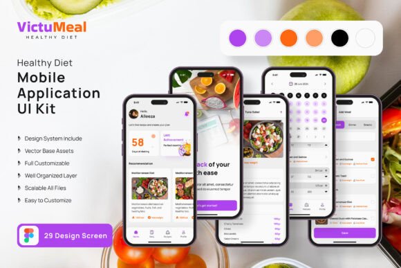
Healthy Diet App Mobile UI Kit Review
In the fast-evolving world of mobile application design, a well-structured and visually cohesive UI kit can be the difference between a concept that lingers and a product that launches with confidence. The Healthy Diet App Mobile UI KIT delivers exactly that kind of advantage—a comprehensive collection of 45 high-fidelity templates purpose-built for health, nutrition, and wellness app projects. Whether you are a freelance graphic designer, a UX professional, or a studio leader juggling multiple brand identity initiatives, this resource offers a streamlined path from wireframe to polished interface without sacrificing creative control.
What Makes This UI Kit a Standout Asset
At its core, this kit is engineered for efficiency and flexibility. Every screen design is pixel-perfect, ensuring that your visual hierarchy remains crisp across devices and platforms. With 80 UI elements and 100 vector layers at your disposal, you can assemble interfaces that feel both bespoke and systematically consistent—a quality that modern design trends demand. The kit is fully editable in Figma, which means you can adjust color palettes, typography, and component spacing to align with any brand’s visual language. The inclusion of a free font and free icon vectors further reduces friction, allowing you to focus on composition and user flow rather than sourcing assets from scattered libraries.
Built for Scalable Branding and Visual Communication
One of the most compelling aspects of this kit is how it supports consistent brand identity across multiple touchpoints. The 100 scalable vectors and symbol objects give you a foundation that can be extended into marketing materials, social media graphics, and even print design collateral. For example, the same icon set you use in your app’s onboarding screens can be repurposed for a promotional landing page or an Instagram campaign—preserving visual continuity without redundant effort. This cross-application potential is particularly valuable for digital marketing teams who need to reinforce brand messaging across web design, UI design, and editorial design channels.
Practical Applications Beyond Mobile Interfaces
While the kit is optimized for mobile app development, its components are versatile enough to influence a wider range of creative projects. Consider these real-world uses:
- Branding and logo design: Use the clean, health-oriented aesthetic as a springboard for logo exploration and brand identity development.
- Marketing materials: Pull vector elements and color themes into presentation decks, pitch documents, or product one-pagers.
- Social media content: Adapt screen mockups into engaging posts that showcase app features or user testimonials.
- Web design and UX design: Translate the mobile layouts into responsive web prototypes, maintaining visual harmony across platforms.
- Editorial and packaging design: Apply the systematic composition approach to layout-heavy projects like brochures, recipe cards, or supplement packaging.
This breadth of application means that a single investment in a quality UI kit can ripple through your entire design workflow—saving hours of repetitive assembly while preserving a modern aesthetic.
How to Maximize the Kit in Your Design Workflow
To get the most out of this resource, start by reviewing the 45 screen templates as a system rather than isolated pages. Identify recurring patterns in button styles, card layouts, and typographic scales. Then, customize the color palette to match your client’s brand identity or your own startup’s visual direction. Because all layers are fully editable, you can tweak opacity, blending, and shadow values without breaking the underlying structure. Pay special attention to the symbol objects—they allow you to update a component once and have it reflect across every screen, a feature that dramatically improves consistency in larger projects.
When evaluating typography, consider how the free font works with your existing brand assets. A well-chosen typeface contributes to readability, emotional tone, and overall professional presentation. Similarly, the free icon vectors should be examined for stroke weight and alignment; small adjustments here can elevate the visual hierarchy and make your interfaces feel more polished.
Design Considerations for Health and Wellness Apps
Health-focused applications demand a unique balance of clarity, trustworthiness, and emotional warmth. The color palette you choose from this kit should reflect those priorities—soft greens, calming blues, and warm neutrals often perform well in this space. Because the kit is designed with a modern aesthetic, you can easily test different color schemes without rebuilding layouts from scratch. This agility is especially useful during user testing phases, where subtle changes in button color or spacing can significantly impact engagement metrics.
Furthermore, the pixel-perfect nature of the screens means that your design will look intentional at every resolution—a critical factor when users are navigating dietary logs, meal plans, or progress trackers. Visual clutter is minimized, and the 80 UI elements are organized to promote intuitive touch interactions. This attention to UX design fundamentals helps reduce cognitive load, making the app feel more like a helpful companion than a complicated tool.
Maintaining Brand Consistency Across Deliverables
For designers managing multiple brand identity projects, consistency is non-negotiable. The Healthy Diet App Mobile UI KIT supports this goal by providing a unified library of components that can be exported and referenced across teams. Whether you are handing off files to a developer or collaborating with a copywriter on marketing copy, the layered structure and symbol-based architecture ensure that everyone works from the same visual source of truth. This alignment reduces revision cycles and strengthens the overall brand identity.
If you are creating advertising campaigns, presentations, or merchandise, the same vector assets can be scaled and recolored without loss of quality. The 100 scalable vectors are resolution-independent, so they remain sharp on billboards, business cards, or app store screenshots. This flexibility is a hallmark of thoughtful design asset creation—it respects the reality that modern brands exist across dozens of formats.
Final Thoughts on Selecting Quality UI Resources
Choosing the right UI kit is about more than acquiring templates; it is about investing in a design workflow that prioritizes speed, consistency, and creative freedom. The Healthy Diet App Mobile UI KIT offers a robust starting point for anyone building health-focused mobile applications, but its real value lies in its adaptability to broader branding, marketing, and editorial needs. By integrating a resource that is fully editable, symbol-based, and companion-friendly with Figma, you set your projects up for smoother iterations and stronger visual outcomes. Whether you are designing for a startup or a well-established wellness brand, thoughtful design choices—supported by quality creative assets—elevate both aesthetics and communication. That is the kind of foundation every designer deserves.
